ShopDreamUp AI ArtDreamUp
Deviation Actions
Wallpapers
If you love wallpapers in different styles, you are in the right place. We offer wallpapers that you have never seen anywhere before, (mostly for phones). Support my work by contributing to my tip jar. Help me stay motivated to publish more artwork so you can access exclusive artwork! Thank you.
$5/month


Suggested Deviants


Suggested Collections


You Might Like…


Description
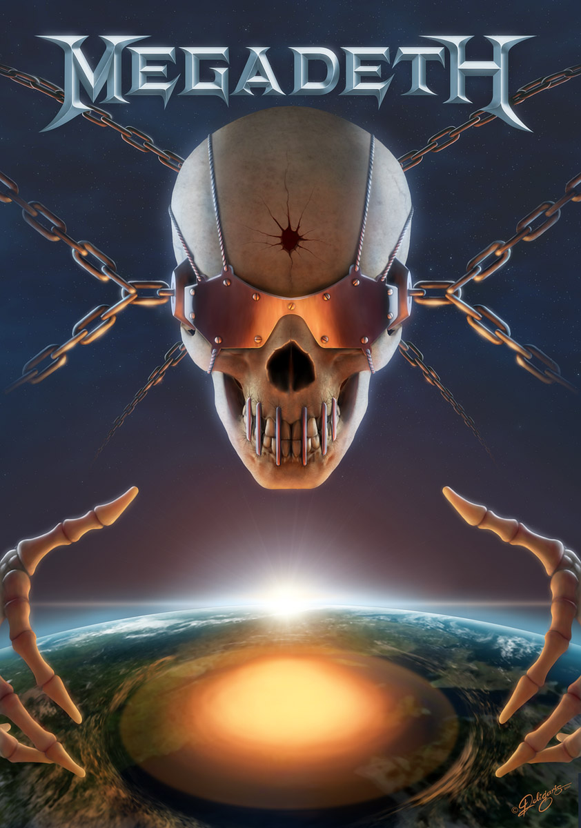
Hello all, and hello Dave  (Wink)") , as you see, this is my entry submission to Megadeth's contest; I couldn't miss this opportunity, hehe
, as you see, this is my entry submission to Megadeth's contest; I couldn't miss this opportunity, hehe  (Smile)")
I thought about this seriously like a commission, and it took me a lot of time to come up with a concept I like, and simultaneusly take into consideration a bunch of other parameters I had to follow. Well, being a graphic designer as well, helped me to work a little more methodically when setting up the composition background while working for other clients.
So, let me explain what I had in mind while making this: First of all of course, I had to give Mr. Vic a face lift, make him look cooler, and "refreshed" and closer to tthe modern standrads in general. I took the classic Vic which I liked, I tweaked some parts, I made the curves more dynamic and gave him more "aggressive" look. I thought about the whole thing as if I was going to make a cover or poster for Megadeth. It should be redesigned up to a point, but still look and remind the band's old mascot, style and philosophy. The same applies to the theme concept as well. I think the subject I chose is quite representative of the band's style. I had to inherit and represent Megadeth's identity; it should look like their previous albums, but better; and every Megadeth fan should recognize it from a distance, without watching the logo.
Being a cover or symbol, the composition should remain simple and not confusing, so that it becomes clear at a glance. The "focal points" must be clear too (here: Vic's head and the explosion). To help towards that direction and catch the viewers' attention, I chose some vivid colors for my palette (without overdoing it, of course) and made the lighting and composition as appealing as they could get (the color palette kinda reminds me of Youthanasia, now that I'm thinking about it).
But still it looks like a heavy metal cover, powerful, aggressive, and kickass in genral (at least, that's what I had in mind while making it...") ). And last but not least, it should look professional, and like it was made by me.
). And last but not least, it should look professional, and like it was made by me.
Made from scratch in Photoshop.
Original size: 4000x5700 px
Thanks for the inspiration Dave Mustaine, I hope you like my illustration! I really enjoyed it anyway...
Also, thanks to the rest of the DA people!
Enjoy, comments are welcome.
I thought about this seriously like a commission, and it took me a lot of time to come up with a concept I like, and simultaneusly take into consideration a bunch of other parameters I had to follow. Well, being a graphic designer as well, helped me to work a little more methodically when setting up the composition background while working for other clients.
So, let me explain what I had in mind while making this: First of all of course, I had to give Mr. Vic a face lift, make him look cooler, and "refreshed" and closer to tthe modern standrads in general. I took the classic Vic which I liked, I tweaked some parts, I made the curves more dynamic and gave him more "aggressive" look. I thought about the whole thing as if I was going to make a cover or poster for Megadeth. It should be redesigned up to a point, but still look and remind the band's old mascot, style and philosophy. The same applies to the theme concept as well. I think the subject I chose is quite representative of the band's style. I had to inherit and represent Megadeth's identity; it should look like their previous albums, but better;
Being a cover or symbol, the composition should remain simple and not confusing, so that it becomes clear at a glance. The "focal points" must be clear too (here: Vic's head and the explosion). To help towards that direction and catch the viewers' attention, I chose some vivid colors for my palette (without overdoing it, of course) and made the lighting and composition as appealing as they could get (the color palette kinda reminds me of Youthanasia, now that I'm thinking about it
But still it looks like a heavy metal cover, powerful, aggressive, and kickass in genral (at least, that's what I had in mind while making it...
Made from scratch in Photoshop.
Original size: 4000x5700 px
Thanks for the inspiration Dave Mustaine, I hope you like my illustration! I really enjoyed it anyway...
Also, thanks to the rest of the DA people!
Enjoy, comments are welcome.
Image size
842x1200px 233.51 KB
© 2006 - 2024 Deligaris
Comments221
Join the community to add your comment. Already a deviant? Log In